Design Case Study: A Menu Story
To begin with: What is Redfrog?
Originally, Redfrog consisted of dozens of websites that were created over 20 years ago.
 Lots of websites like this one 😱
When I joined, the goal was to merge all of these websites into a one big webapp designed by an external agency.
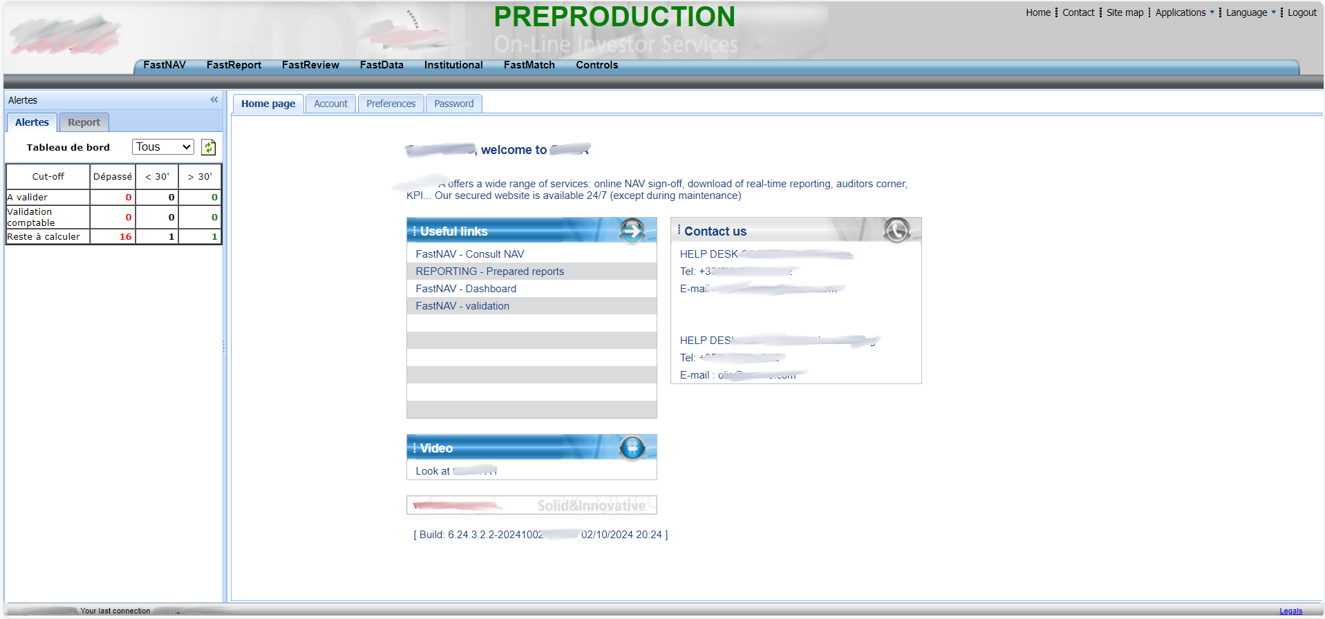
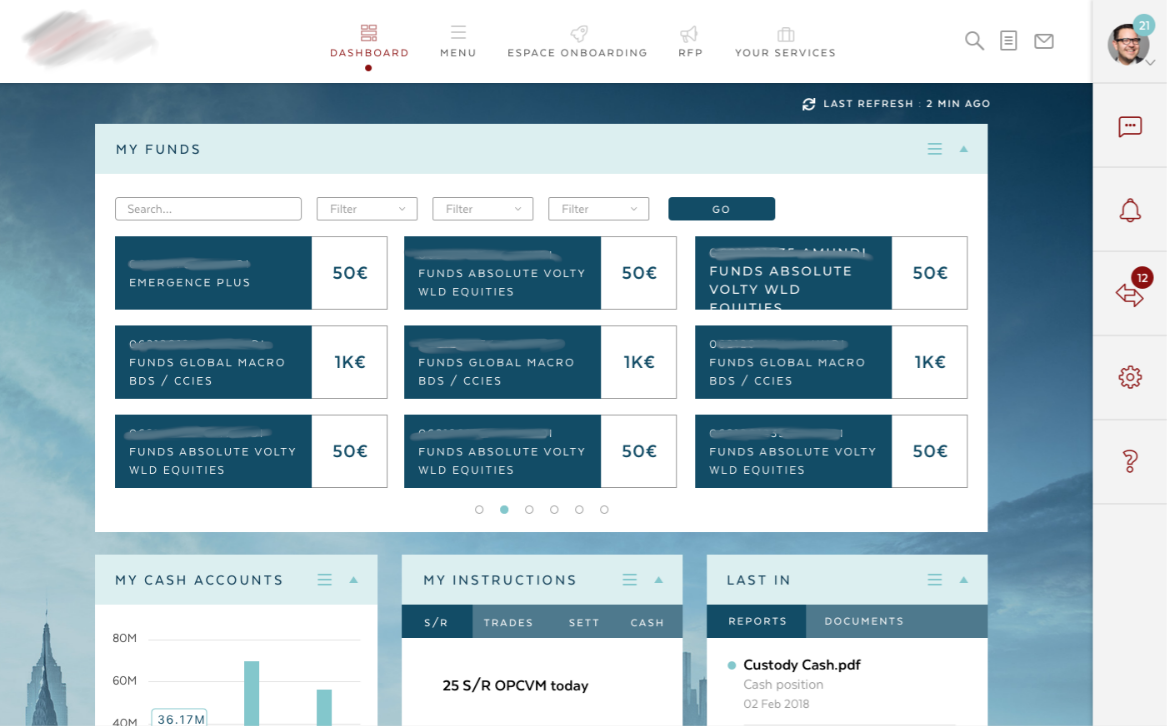 This was the agency's proposal 🤐
 A super mega menu 🤐
Redfrog is designed for companies that want to purchase, manage funds, or handle other financial products. It’s a comprehensive dashboard meant for daily use.
Our users include employees from financial companies, as well as our internal staff.
It’s an interesting product because there’s always something new to work on: onboarding, chat features, AI, dashboards, user management, reporting, mobile access, accessibility, libraries, design systems, and more.
At times, it feels like an overly complex system, but it’s our team's job to ensure it remains efficient and user-friendly.
Team and Role
I was hired in 2018 to help create this app as an Angular front-end developer and a UX/UI designer.
At the time, we were 6 front-end developers, 3 back-end developers, and 2 designers. Today, there are almost 15 developers, but still only 2 designers.
As the Product Designer, I closely collaborate with another designer, whom I taught to use Figma. I’ve built a new design system, a UI kit, and a lot of products.
I also work a lot with developers, reviewing pull requests to validate the visuals and working together to decide which components are best suited for each feature.
In addition to design, I lead the UX process, which involves user interviews, workshops, and design thinking sessions. I collaborate closely with Product Owners and Product Managers to ensure alignment with the business line. Together, we follow an agile methodology to continuously iterate and improve the product.
Initial Design
In my opinion, the design was too complicated to use and not very visually appealing.
As we began working on each module, we first made gradual changes to the UI and the UX progressivly.
 New UI
But that wasn't enough. The ux was still not okay. While the modules were clear and nice, we hadn't changed the main layout.
As a result, this UX case focuses on our most-used feature: the menu.
Or should I say, menus...
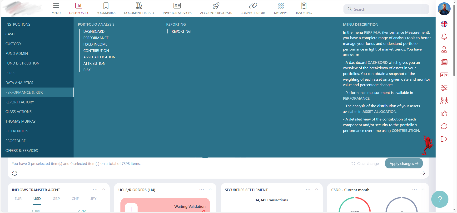 Horizontal menu, Mega menu, Right Sidebar menu, "Menu" in
Menu...
Horizontal menu, Mega menu, Right Sidebar menu, "Menu" in
Menu...
Problems
- Too many menus
- Too many elements in the mega menu
- Complicated and unclear user experience
- Users are not familiar with computers (finance professionals)
Solutions
Simple...
- Start from scratch
- Revisit all processes
UX Research
Before conducting any research, we began by analyzing the existing product.
The best method was to determine our KPIs, and then, in a qualitative study, allow existing users (who were unfamiliar to us) to use our app in front of us.
Our goal was to understand our main pain point: the menu. We already knew it, but we learned a lot of interesting things along the way.
We also conducted a quantitative study with all our clients to gather feedback.
With all the information gathered, we were ready to move forward. In our company, even developers participate in grooming, design thinking, and more. It’s always valuable to get everyone’s opinions, even if it doesn’t always lead to smooth results...
Especially when dealing with users who aren’t sure what they want or need.
We followed the classic UX processes, conducting interviews with existing users at each step.
Wireframes and Low Fidelity Prototypes
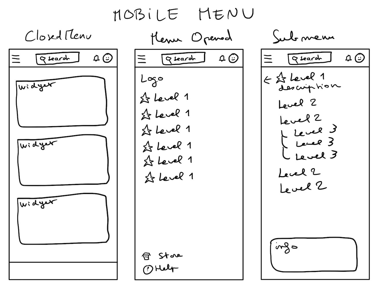 Mobile
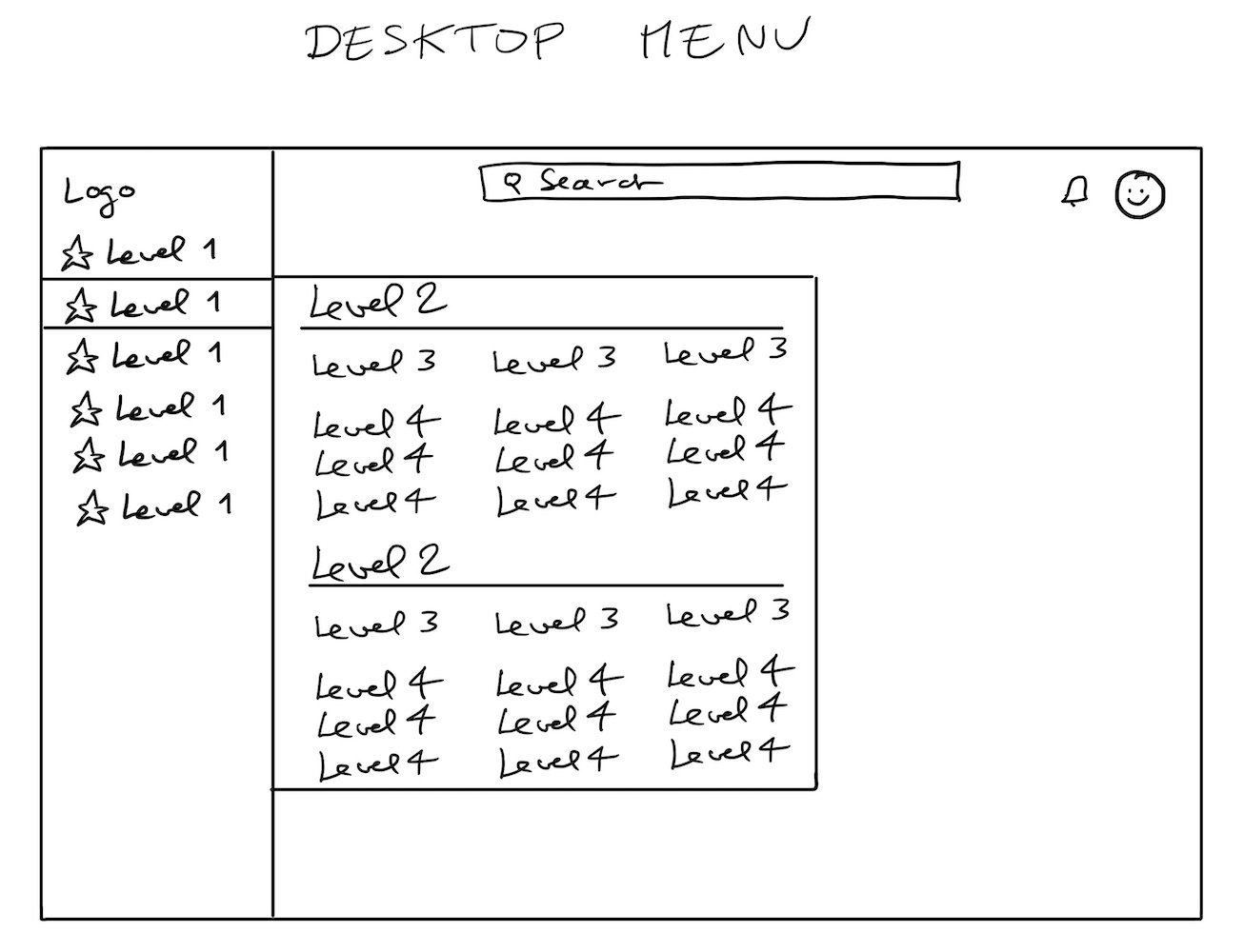 One of the first ideas
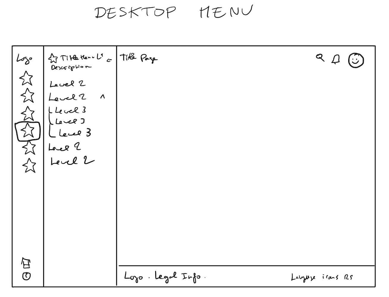 Chosen idea
We created many wireframes to understand the needs and find the best possible solution.
Through this process, we realized that search was the main issue in the menu. It was difficult to find anything, even with a clear menu, because there were simply too many elements.
Visual Design
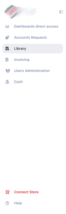 Sidebar Light
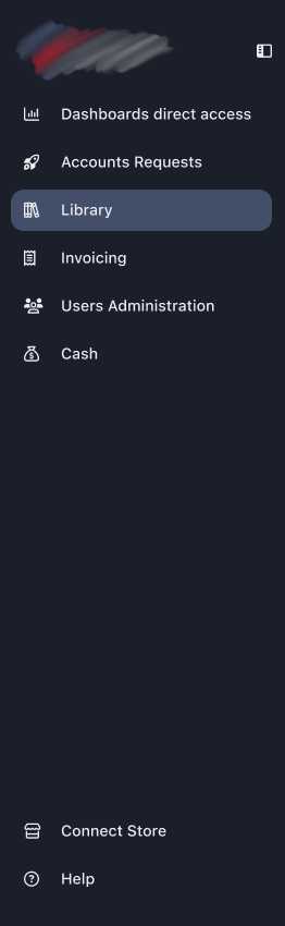 Sidebar Dark
 Double Sidebar Light
 Double Sidebar Dark
It was the perfect time to clean up our Figma files and update some components. It required a lot of work.
The front-end developers also had a significant amount of work on this part.
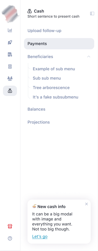
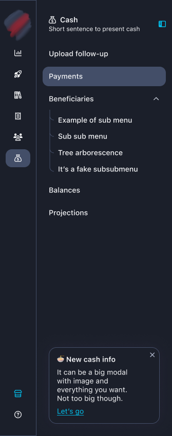
High Fidelity Prototype
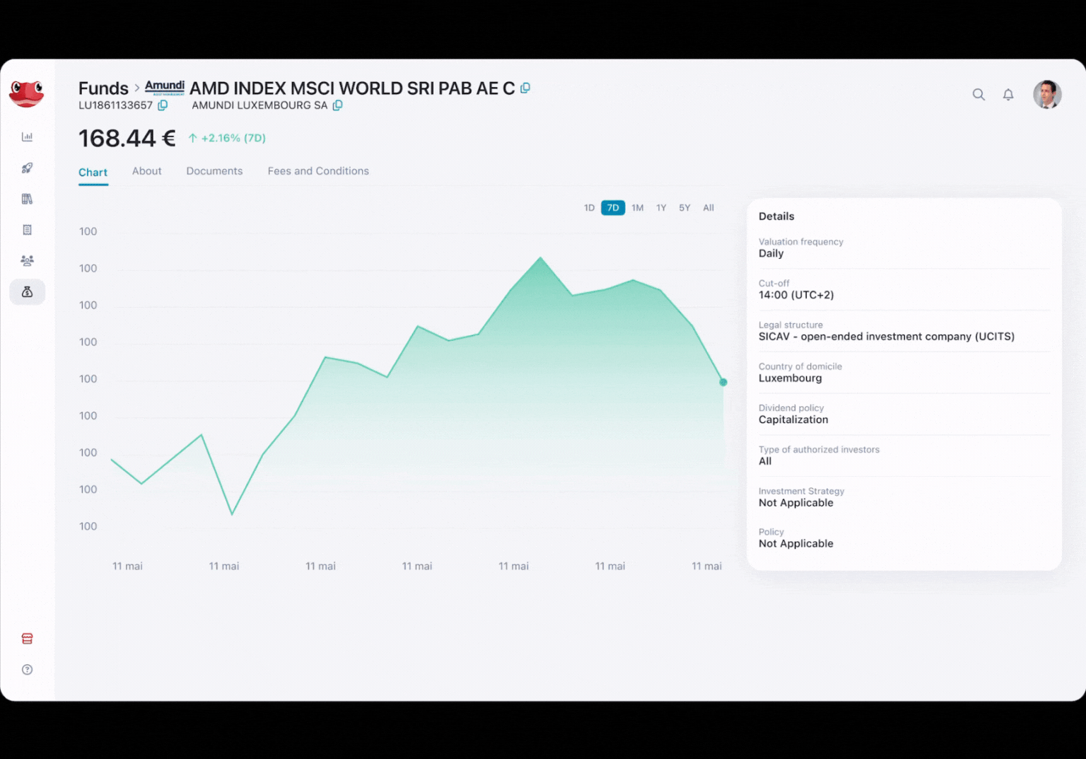 Example used for workflows validations and demos.
Results
- Adoption rate of new menu features: more than 80% of users.
- Average time to locate a module or widget: Reduced from almost a minute to less than 15 seconds.
- Drop-off rate during menu navigation: 10%, down from more than 40%.
- User engagement rate on mobile: Increased from 1% to at least 10%
- Client conversion rate from demos: Exact numbers unavailable, but business teams are very happy, and we received many demo requests.
- User satisfaction rate after design updates (CSAT): Improved from approx 40% to 80%
- Reduction in navigation-related support tickets: Dropped from almost 70% to 20%
Users find the app much more user-friendly. They can now easily find their modules and widgets.
- What they gain: No more getting lost, improved performance, clarity, and the ability to use the app on mobile if desired.
- What we gain: New clients and happy clients. Our employees conducted many demos using Figma prototypes to showcase our new solution.
And now?
There are still, and always will be, new features to create. It remains a challenging app to work on.
If you want to see more of my work, you can check out my Dribbble. Please note that I only share projects I fully designed on Dribbble, as I prefer not to showcase work where I only "participated".